The Kamala Harris campaign has co-opted the irreverence of the British pop singer Charli XCX’s latest album Brat to make her brand relevant to a newer younger audience. The slime green of that album is everywhere this summer, from T-shirts, nail varnish and hair dyes to paint and even Bottega Veneta handbags.
Why has the “Brat” idea and above all the Charli XCX album’s slime green color had such an impact? Why is linking Brat and Kamala Harris so effective? Because it meets the definition of great Marketing Creativity.
What is Great Creativity?
To paraphrase Dave Stewart, Chair of the Marketing Accountability Standards Board and very wise academic, there are three types of creativity:
- Scientific Creativity, which is defined as coming up with new products and concepts that work, and is therefore judged by its effectiveness
- Artistic Creativity, whose purpose is to create an emotional impact, and is judged by its originality
- Marketing Creativity, which requires both originality and effectiveness
What is great Marketing Creativity?
Great Marketing Creativity must inspire a powerful emotional reaction among its intended audience, and at the same time achieve a concrete business objective, which can be anything from increasing sales, to building brand, to simply raising awareness and many other goals. For Marketing Creativity, the emotional reaction comes first. This is what drives effectiveness.
How do you achieve great Marketing Creativity?
How do you create an emotional impact, and one that has not just immediate but also lasting effect?
First, the Marketing Creativity must communicate the desired message.
This can be anything—from getting people to buy the product, to changing perceptions of the brand, to simply inspiring a particular emotion. You may remember the iconic Cadbury chocolate campaign featuring a gorilla playing a drum set. This abundantly communicated the desired outcome, which was quite simply “joy.”
Next, the message must reach its target audience.
It can do this in any way that works for the audience. This can be just about anything:
- Traditional channels, such as TV, print, or billboards
- In-store displays and promotions, online or brick-and-mortar
- Guerilla marketing
- Events and business conferences
- Most important today, digital and social media, videos, influencer promotion, emails, text
- In business, in-person calls
If the message doesn’t get through to its audience, whoever they are and wherever they are, it won’t achieve business impact. The most powerful creative will be a waste of time.
How do you create a powerful message that tells the story?
It can be composed of many elements, or just one. These elements can be just about anything:
- Voice and tone of voice
- Location and environment
- Music (note sequences, songs or jingles)
- People, characters, clothing (especially if you are a political candidate-look at the two potential US vice presidents)
- Touch, feel, and even smell
Mastercard is all in on pursuing what it calls “sensorial branding,” and has launched two perfumes (!) and cards with notches cut in for the blind.
Color—one of the most emotion-inspiring devices
Many of the most iconic and valuable brands create impact through association with a particular color. In many cases, they’ve even trademarked this color. Think of Coca-Cola’s red, Barbie’s pink, Cadbury’s purple, Tiffany’s blue and UPS, brown everything everywhere except Germany where they had to change the uniforms to green, (due to the Nazi association with brown).
Whole categories of brands tend to use the same color—blue for healthcare (connotes calm and security), red for emergency services (connotes danger, but also love and happiness, paradoxically but perhaps not—love can be dangerous after all).
The slime green “Brat” color
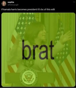
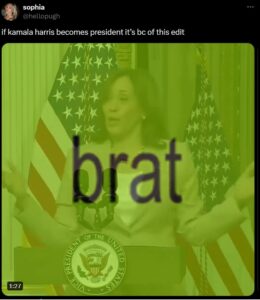
The sudden surge of the slime green “Brat” color to prominence is a wonderful example of the power of color to become great marketing creativity. This seems to have been somewhat accidental. Brent David Freany, a graphic designer at a small Manhattan studio and its creator, told the New York Times that It was intentionally repulsive: “The directive was: I don’t want this to feel like it has any taste. I want it to feel off-putting and kind of garish.” The design was for a cover for the British pop singer Charli XCX’s latest album Brat.
The word “brat” dates to the early 1500s. It originally meant “a wily beggar,” but over time shifted to “spoiled.” It’s now generally used to signify youthfulness and indulgence. The term “Brat Pack” was coined by David Blum in 1985 for a New York magazine cover story to describe a new set of playboy actors under 25, including Tom Cruise Nicolas Cage and Rob Lowe. The word was picked up by the subversive riot grrrls of the 1990s. One of their leaders, Molly Neuman described her and her friends as “stylish, full of attitude, with a lack of respect for authority.” The followers of her band named their riot grrrl movement “bratmobile.”
Charli XCX presents herself as hot, trashy, badly behaved, and self-centered, with an attitude, dress and makeup style to go with it. But unlike her predecessors, Charli has a color. The obnoxious slime green sums the idea up and communicates it with astonishing power. The power is also in its simplicity. The design is plain slime green with just the word “brat” in basic arial font.
The slime green “Brat” color is now the color of the Kamala Harris campaign. The definition of “Brat” is now slightly modified to “accepting your imperfections while embracing the chaos.”
How did “Brat” green come to be the color of Kamala Harris?
In one of her songs on the new album, Charli XCX used extracts from one of Kamala’s speeches. This was picked up by the KHive, a dedicated but struggling online group of passionate Kamala Harris followers (KHive is a play on BeyHive, the name of Beyonce’s fan base).
The inspiration was Kamala Harris’ remark at a 2023 White House event when she chuckled, quoting her mother, “You think you just fell out of a coconut tree? You exist in the context of all in which you live and came before you.” This not only gave rise to an outpouring of coconut memes but positioned Kamala as irreverent and cool. And it sorts of fits. She’s seen as being “comfortable seeming a little silly and leaning into that goofy aunt energy.”
Brat and Kamala Harris: It works.
Earlier, Kamala had not been seen as a viable alternative to Biden. She had difficulty finding her feet in the vice president role. She was seen as not only disappointing but ineffective. All this was not helped by the fact that she was sidelined by the Biden administration and given either low impact tasks, or impossible ones.
The association of Kamala with “Brat” green has played an important role in changing all that. It has reinvented and reignited the Kamala brand. The Facebook page “Ridin’ with Kamala” now averages 334,000 reactions shares and shares a day, up from 62,000 when its name was “Ridin with Biden.”
The Democrats are winning back their appeal to young people, black and white, and to other generations as well. The new Kamala brand is showing not only emotional but financial results. With Brat and Kamala Harris branding, the campaign raised over $200 million in the week after Biden withdrew from the race. The “Brat” slime green communications crystalize the new Kamala Harris brand idea. And they fit the definition of originality and effectiveness. They truly qualify as great creativity.
Will it last? Will Kamala win? Will we carry on seeing slime green everywhere. Or will it be like Barbie pink? We don’t know if the “Brat” green communications impact will last, but it has quite definitely made a major difference in the short term.
What are the learnings for marketers? Be bold. But be authentic. Keep it simple. Pick the right channels. You don’t need to do so much. You don’t need to spend so much. Just do it right and on brand.
See the Brat and Kamala Harris branding: