By Rohan Gharekhan
New branding must be done with care. Can a brand survive an identity crisis if it changes its name, color, and personality every few years? That’s the question looming over the streaming service formerly known as “HBO GO” and “HBO Now,” then “HBO Max,” and now… simply “Max.”
This is a story of branding missteps, identity dilution, and the slow walk back to preserving strong brand equity – i.e., what worked in the first place.
Update: Within a day of this article’s publishing, Warner Bros. Discovery announced a rebrand back to HBO Max. While we wish we could take credit for their decision, we certainly do endorse it, because it reinforces the premise of the article below. The true equity of this streaming service is in the HBO brand. Straying away through multiple rebrands has hurt the streaming service, and any move that builds on the original HBO equity would only help grow the business..
Adapting in the Age of Streaming
For decades, HBO was synonymous with premium television. The name carried weight. Prestige. Edginess. Sopranos, The Wire, Game of Thrones. You didn’t need to explain HBO. You just knew.
In the 2010s, with the rise of streaming as a new medium for content consumption, HBO adapted with new branding of two offerings: HBO GO (for cable subscribers) and HBO Now (for cord-cutters). Confusing? Yes. But still rooted in a strong brand.
In 2020, to address this confusion, consolidate and be better-equipped to take on Netflix and Disney+, HBO Max was launched – combining all WarnerMedia content under a single umbrella. The new branding of the platform was now a one-stop shop for HBO Originals + Warner Bros. + DC + TBS/TNT + Cartoon Network + Studio Ghibli + Friends + the Big Bang Theory.
Yet, there’s a common misconception that “Max” is short for Cinemax. It isn’t. Despite both brands living under the WarnerMedia roof, Cinemax content was – and still is – notably absent from the platform. The name “Max” was chosen not as reference to Cinemax, but as a promise: maximum value, maximum variety, and something bigger and broader than HBO alone could offer.
To signal this new name and offering came a bold new purple logo – a break from HBO’s traditional black and white color scheme of years past.
The move to purple was more than aesthetic. On the color wheel, it sits between red (which typically evokes energy) and blue (which typically evokes trust), communicating new branding of a platform that could offer it all: depth, diversity, and distinction.
Then Came “Max” New Branding
Following WarnerMedia’s merger with Discovery in 2023, HBO Max dropped the “HBO” altogether. It became simply “Max.” The rationale for the new branding? Broader appeal. More family-friendly. Less intimidating for parents. As JB Perrette, CEO of Global Streaming at Warner Bros. Discovery, put it at the time of the re-brand: “We all love HBO. But it’s not exactly where parents would most eagerly drop off their kids.”
The message was clear: The HBO brand was too elite, too adult, too specific. The new streaming brand needed to feel inclusive and friendly. But in this quest for “friendliness” and “inclusivity” the brand has arguably lost its anchor and recognizability. Max may be friendly and be a popular boy’s name. But it’s generic. It’s a term used by many companies to suggest higher performance. Even the Wikipedia entry now needs to clarify that the new branding is for a streaming service!
Source: Wikipedia
The logo changed too. Gone was the deep purple. In came bright, corporate blue. Why? “Blue is the most loved color by the most audience segments,” said then-CMO Pato Spagnoletto.
We on the other hand would call it what it is: Safe. Familiar. Boring.
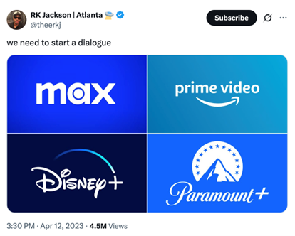
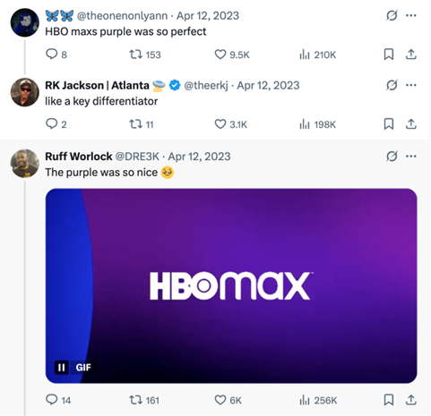
Social media mocked the new branding color switch. A popular post pointed out how the sea of streaming logos – Disney+, Prime Video, Paramount+, and now Max – all looked the same. Blue logos have quickly become the new “millennial gray.” As opposed to Gen-Z’s “Brat green!”
Source: x.com
March 2025: Back in Black
On March 30, 2025, Max pivoted again – this time back to black. The new branding color is a nod to the original HBO identity. A signal that the platform hadn’t forgotten its roots. And perhaps, a quiet admission: the move away from HBO and its strong brand equity wasn’t working.
It’s not hard to see why. Max’s latest slate of HBO originals (i.e., The White Lotus, Succession, The Penguin, The Last of Us) have all been hits and dominated cultural conversation. Max may be the formal name, but viewers still say, “Did you see the new HBO show?”
Also not coincidentally, Spagnoletto – the executive who spearheaded the blue logo – left the company in 2024.
Despite the prestige of the HBO name, recent brand equity data paints a more sober picture. According to Kantar’s BrandZ survey, Max lags behind five of its biggest competitors – Disney+, Hulu, Prime Video, YouTube, and Netflix – across key metrics: meaningful, different, and salient. In short, there’s work to do. They need new branding done right.
The good news? The foundation is there. Max has the content. It has the heritage. And this latest move – coming back in black – is a step toward recapturing what made the brand great. A signal that the team knows where the brand belongs and is making moves to right the ship.
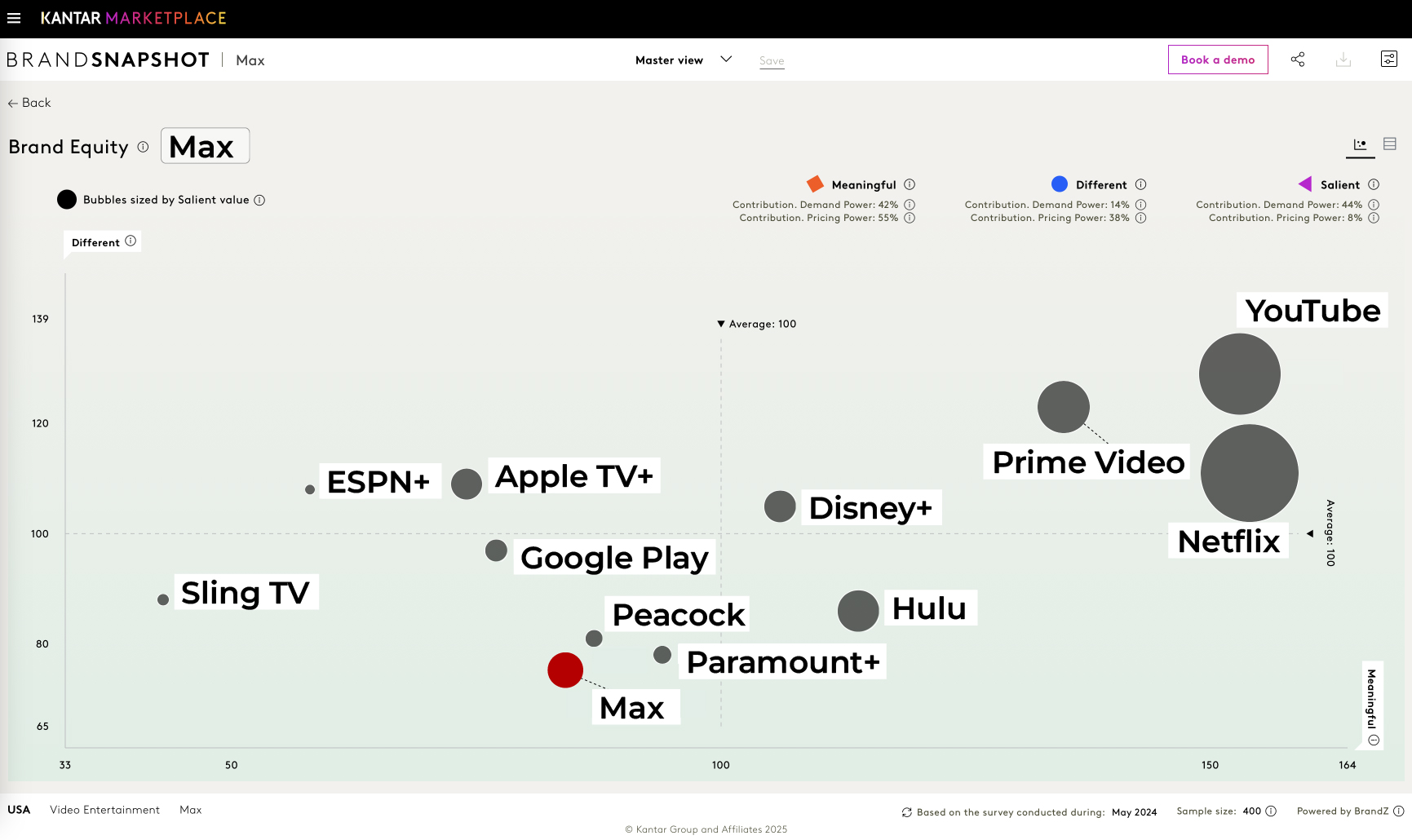
Source: Kantar (2024 BrandZ survey data). Meaningful = how well brands are meeting emotional and functional needs, different = how well brands are standing out from competitors, salient = how easily brands are coming readily to mind.
Lessons in Brand Identity
There’s a reason why brands like Netflix and Disney+ stick. Simplicity. Consistency. Clarity. What Max has done is the opposite: a revolving door of names, colors, and rationales that leave consumers scratching their heads.
And yet, there’s a deeper truth here: branding is not static. Mistakes happen. Good companies learn, pivot, and try again. That Max is returning to black suggests a willingness to listen – whether that be to users, popular discourse, or to data. We only wish they’d listen more and revive the purple!
The Max new branding and constant rebranding saga is a reminder that nomenclature and visual identity are not superficial choices. They’re strategic assets. And when wielded wisely, they can be the difference between being just another blue streaming service… and being HBO.
Do you think your company’s brand identity is facing a similar identity crisis? If so, we’d love to chat!